A seasonal visual system created for Rishon LeZion Municipality’s summer events. The goal was to replace scattered, stock-based designs with a clear summer identity, one that feels youthful, bold, and instantly recognizable as a city-led initiative, built to scale across years and events.
System & Concept
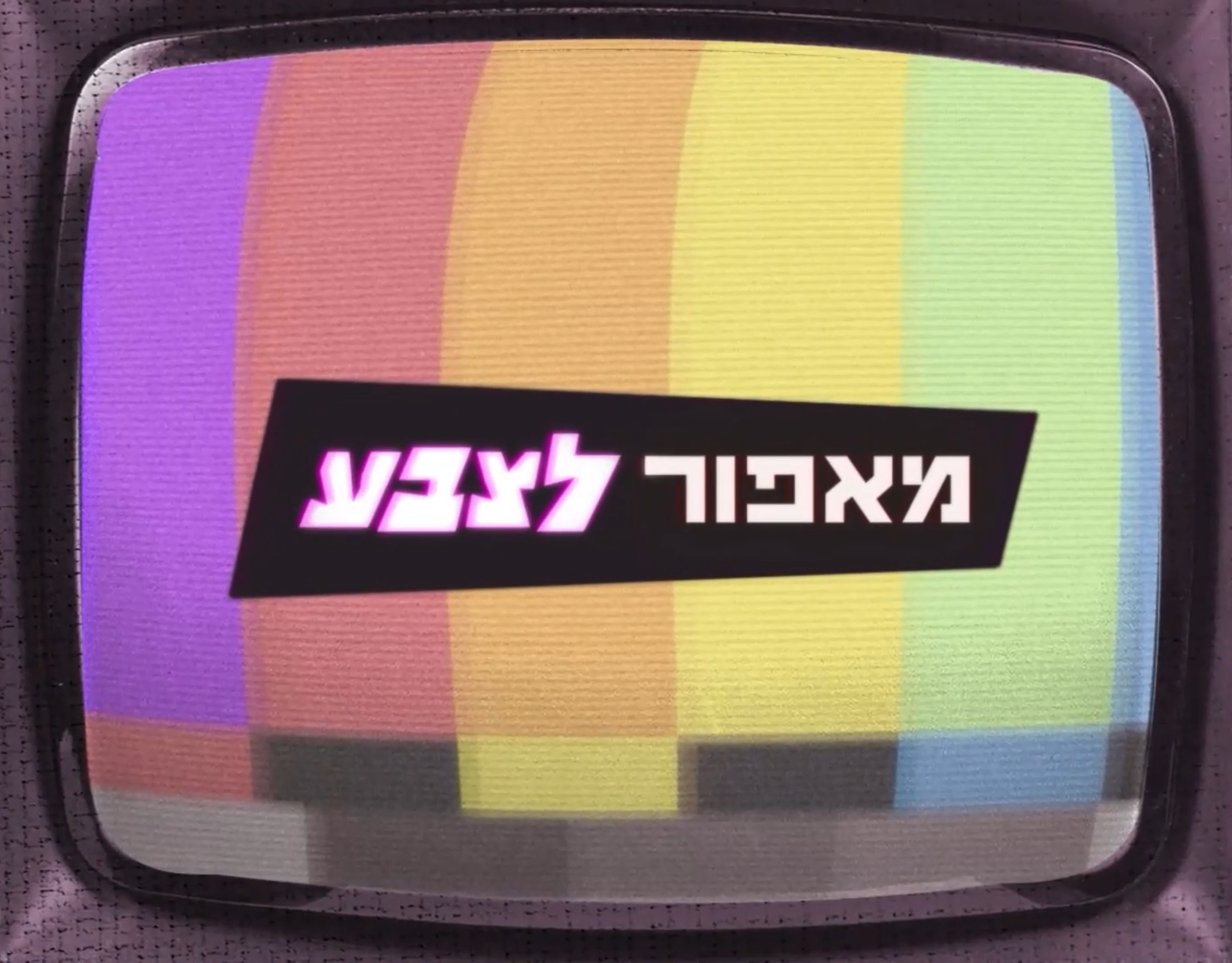
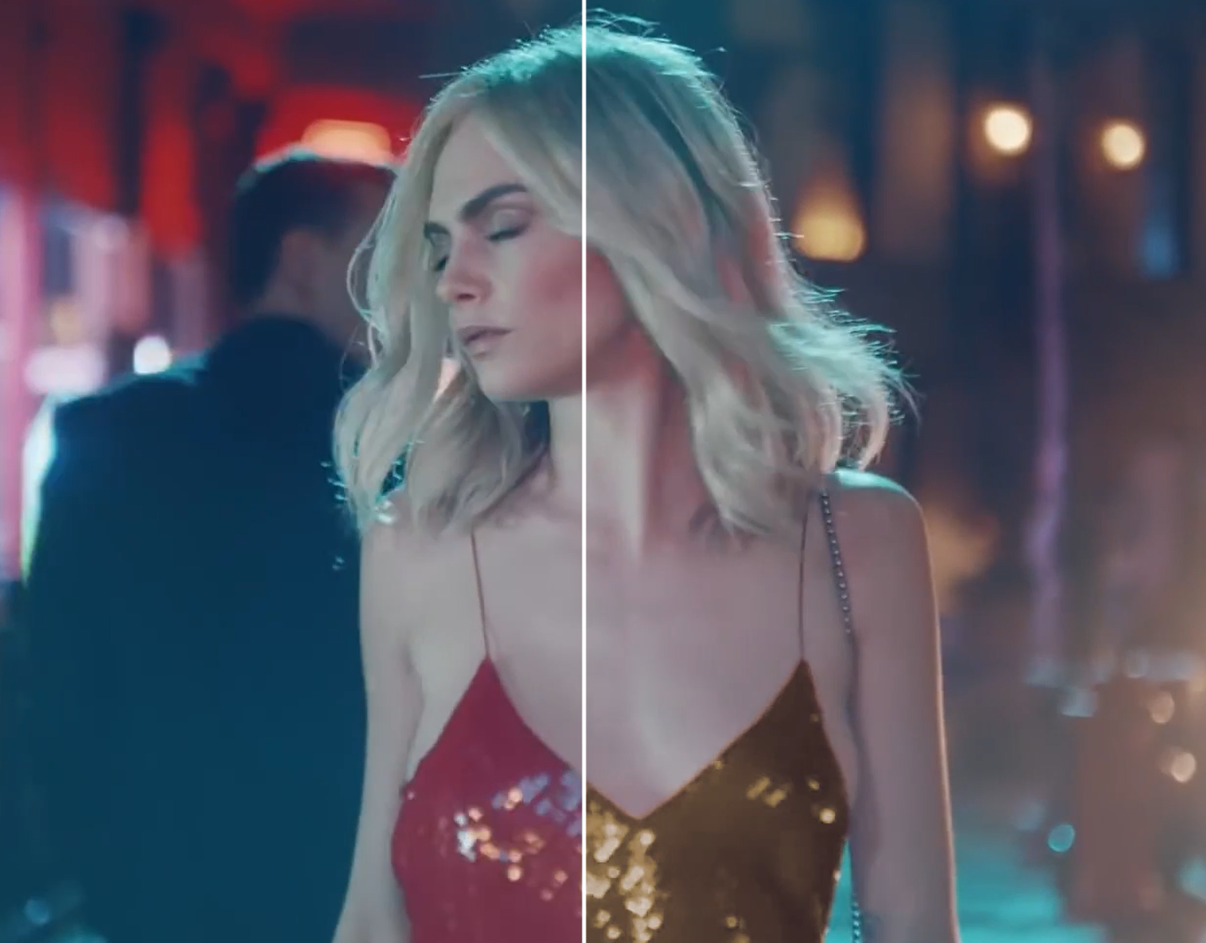
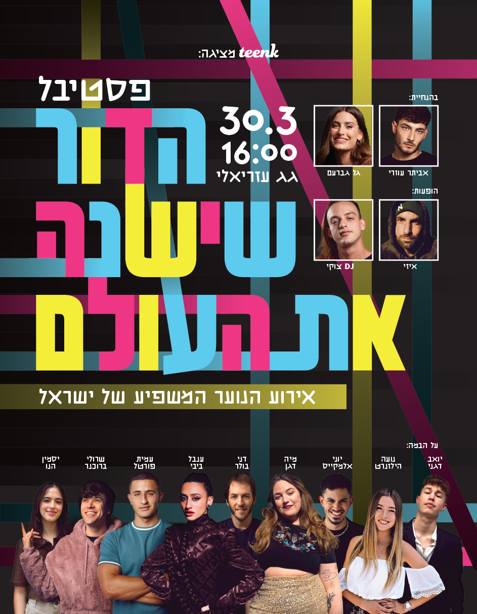
developed a flexible branding system based on a strong grid and a recurring “prism window” - a dreamy gateway into each event.
Inspired by psychedelic poster culture and contemporary flattening, the system balances expressive visuals with strict structure, allowing every event to feel unique while clearly part of the same summer movement.
Process & Handoff
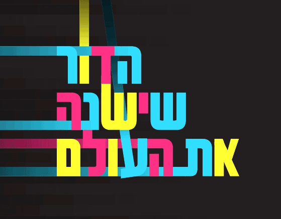
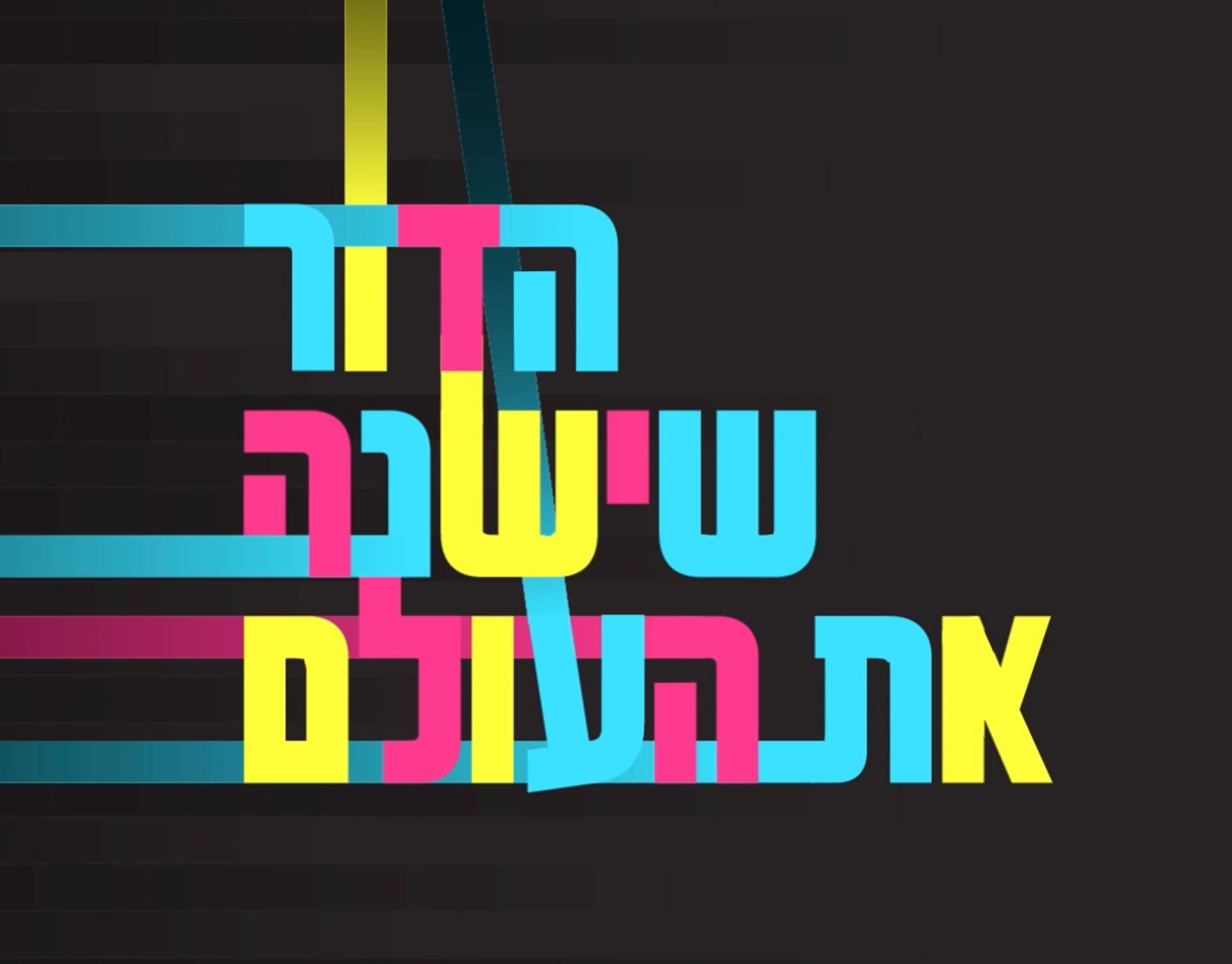
led the concept, naming (RE:shon), logo, grid logic, and full visual language, then translated it into a clear brand guide.
The guide was designed for seamless handoff, enabling other designers to apply the system confidently to new events without compromising consistency or intent.